Showing posts with label Header. Show all posts

Sunday, 1 May 2011

blogspot: unlocking the header widget so that you can place it in a different location

Oooops! A couple of posts ago I was talking about making a vertical header and completely forgot to mention something very important related to that: In order to move your header to a different location on the site you will have to do some sniffing around inside the HTML editor (with expanded widgets!), where you need to find this line:
<b:widget id='Header1' locked='true'
and change it to
<b:widget id='Header1' locked='false'

.................................................................................................................................

Saturday, 30 April 2011

design: making a vertical header


I have been meaning to try this out for quite some time, for a number of reasons: First off, it does get kind of boring to always have horizontal headers at the top of a website: The way in which a website is constructed vertical elements such as the columns do look very good. So, why not use the vertical components of the layout for design strategies, as well as a place for info elements such as labels and link lists?

And then also, web real estate: If you have the content starting all the way at the top of the page, you will be showing considerably more at first sight - obviously.

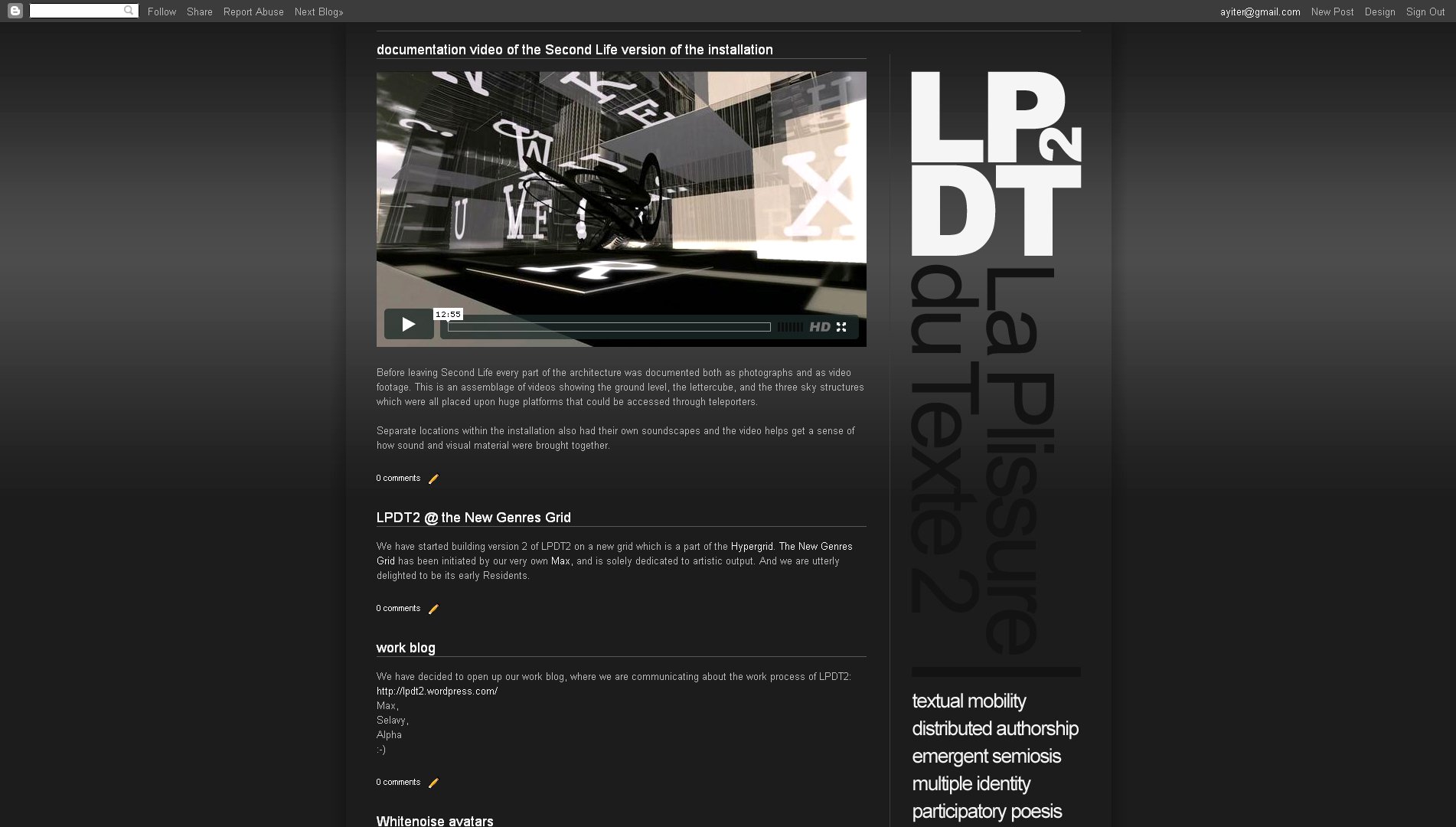
I just made a website for an art project in which I am involved, and since the logotype of this is a square which works well when placed on a corner with the site description "dropping down" from it (so to speak), this seemed a very good opportunity to give the idea a shot.

Remember that before all else you will need to unlock the header widget! To find out how this is done read this post here >>>.

The template which I used is the one which I took from this site, except that I changed the layout and the number of columns, as well as their widths and proportions, so that the vertical header fit into the corner without looking cramped in. Needless to say the whole thing took a bit of aligning, which these days I do quite quickly by playing with the margin values, as is explained here >>>

See the result here:

.................................................................................................................................

Thursday, 21 April 2011

moving the header image in blogspot

I could beat myself up! All that time I spent trying to align header images! And it never even occurred to me that there might be a really simple way of doing it (or rather of polishing things off). Well, there is, and this is it:

#header img {
margin-top: 0px;
margin-left: 0px;
}

Paste the above code into the CSS box on the Advanced Template Editor, play with the values highlighted in black - and watch things move!

Not that this will save you the initial design work that needs to be undertaken in the image editor, obviously. To get a really good clean look you will still need to align the blog columns and the header elements in the way in which I described it here. However, all that done, you may (and probably will!) need to tweak things still further once back inside the HTML environment. And that would be the point where this code snippet will prove its weight in gold!

.................................................................................................................................

Monday, 11 April 2011

custom header for blogspot

As you will see up top we now have a custom header. Not just a plain header text image, but also a second line with a menu and image rollovers. 

Very easy (and also very tough) to make: The tough part was getting things aligned properly and it basically just involves a lot of trial and error. Lots of going back and forth between photoshop, dreamweaver, blogspot and picasa to where I uploaded the blog title image which I kept tweaking to get right and then re-uploading. Still not completely there - but it will have to do, I guess.

I used a basic table*** inside dreamweaver to assemble this, from where I copy pasted the entire code (also including what was in the <head>) into a custom HTML/Javascript gadget. The gadget will automatically delete unneeded info as it saves, except for one line at the top - the document title, which you have to then go back and get rid of manually.

Something to remember when you do this is that you have to put all the images that you are using online first, and then embed the image URL's into the correct table cells in the HTML editor. The menu is actually a direct copy paste from the HTML gadget which we had on the sidebar, into a table cell in dreamweaver, and the images which that one uses are also online, of course.

Dreamweaver, with it's split window is wonderful of course, and I have been looking around to see if there is a comparable software which is free. However, no such luck so far. The best that I have been able to find is called Page Breeze and you can download it from here >>>. You do have a visual interface on this, which helps, however no split window, I'm afraid.

And finally, you can see the full code of the header, where I am also highlighting a few important parameters which you need to pay attention to in order for everything to properly work, here >>>.

*** No lovely CSS <div>s for me. My skills do not go that far - not even close... ouch!

.................................................................................................................................

Monday, 4 April 2011

design: using photoshop plugins for website backgrounds and effects


geek.folk goes elegant ;-). This is to show you how to use photoshop plugins and filters to achieve effects on your background and header.

I didn't change much from the previous layout and even the glass buttons are still here, except that I applied a dark layer style to them this time.

On the background I used a plugin named Sinedots II, freely downloadable, courtesy of a very generous gentleman named Philipp Spoeth, who has been making this wonder available (PC only - ouch!) right here >>> for a very long time. Just place it in your plugins folder and the rest is fairly self-explanatory, although there are a few tutorials on it available on the download page as well. In this case I just applied the plugin onto the full canvas and then used a layer mask to delete the top and the bottom. Moved it up to where I wanted it to be, and that was that. In any case, this is such a beautiful filter that it would be kind of hard to go wrong with it no matter how you use it...

On the header, where I switched the font to Bauer Bodoni this time, I used the standard photoshop lens flare filter which is under Filters > Render. Now, here is the trick with that: It is actually quite difficult to get this to sit exactly where you want it to sit. What I do is, I create two layers in the same color, and then put the lens flare dead center in the middle of the top layer. Apply a gradient on a layer mask from all 4 sides  (Tip:  make sure you have the gradient colors going from solid black to transparent white, otherwise you will keep painting over what you are doing  )  then move, rotate, resize the flare to exactly where you would like it to be - which in my case is behind the header text so that I get a nice highlight there to offset the dark typography.

(Note: If I were to actually make such a site, I would place the flare on the background, together with the sinedots effect, so that the content slides over it as the viewer scrolls downward).

And you can see everything that I did in the photoshop file which you can download from here >>>.

.................................................................................................................................

Friday, 1 April 2011

splitting up the header in blogspot

Today seems to be shaping up as a Fırat Gunal day here on easy peasy. While he is busily developing his own site he has been fabulous about finding some really useful stuff which we can share here as well: 

You may want to add a button or a search box onto the header of your website. In which case you need to split it. Here, as re-blogged from BloggerSentral, is how to do this:

Go to Dashboard > Design > Edit HTML. Make sure the Expand Widget Templates check box is un-checked. Look for the following lines in your HTML code:
<b:section class='header' id='header' maxwidgets='1' showaddelement='no'>
<b:widget id='Header1' locked='true' title='My Test  Blog (Header)' type='Header'/>
</b:section>

Insert the following code right under (after) it:
<b:section id='header-right' showaddelement='yes'/>
<div style='clear: both;'/>

So the final code should look like this:
<b:section class='header' id='header' maxwidgets='1' showaddelement='no'>
<b:widget id='Header1' locked='true' title='Blogger Sentral Widget Showcase (Header)' type='Header'/>
</b:section>
<b:section id='header-right' showaddelement='yes'/>
<div style='clear: both;'/>

You now have two sections in the header, the section with the existing blog title on top and the new section below it. You will now need to position the sections side by side, by floating the section containing the blog title to the left,  and the new section to the right. To achieve that, locate this line of code:
]]></b:skin>

Add the following CSS code right before (on top of) the line:
#header, body#layout #header {width:50%;display:inline-block;float:left;}
#header-right, body#layout #header-right {width:35%;display:inline-block;float:right;padding:15px;}
#header-right .widget {margin:0;}

Now it is time to add the banner, search box, or whatever it is that you want to add. Go to Design > Page Elements and click the Add A Gadget link to add your widget. If the added widget shows up under the blog title (instead of on the same level, on it’s right), go back to the CSS code, and change header and header-right widths and experiment with different values until you get it right. And you can see a screenshot of how this looks on Fırat's post.

 (Extra little tip from Fırat:  You can also do this by going to Design > Template Editor > Advanced > Add CSS where you will see the newly added code and also how the header looks on the page. Much easier to tweak values when you actually see what you are doing at the same time!  ;-) 

Sunday, 27 March 2011

playing around with photoshop layer styles


I downloaded the styles mostly from 22 pixels, however I may have looked elsewhere too. Just pull in a whole bunch and put them in the styles folder under photoshop presets. Then click on the little right arrow at the top of the styles palette in photoshop to load them. And my advice is to leave their values more or less as they are. It is quite easy to lose the effect altogether if you start tweaking them too much. I used the vector shape tool and I also installed a few dingbat fonts since layer styles seem to work especially nicely with shapes. (The two circle arrows on the right are in fact dingbats).

Only other thing I did was that I added a little divider line between the menu items. A tiny little vertical 1 pixel grey stroke and then gave that a motion blur at 90 degrees exactly, so that it faded out at both ends.

And the photoshop file, where you can also see how I aligned the stuff, is here:

.................................................................................................................................

Tuesday, 22 March 2011

clean typography for website headers


I am not sure that what is shown above even needs much further explanation.

Clean typography, plenty of space, the usage of one strong color together with a lot of neutral ones such as grays, black and white - and you are more or less home and dry.

There will of course be occasions when the content of your site will necessitate that you use a company logotype or some sort of extra visual indicator on what the site is all about. But even then clean solutions will usually work much better since a website gives you a very small area to work on and things will usually end up being be placed very close together to begin with; so wherever you can be clean and simple it is good practice to go for it.

One thing web designers make a lot of usage of however are all the stylistic details which they use to enhance their work, by giving it a dimensionality which makes elements stand out from the page. When you look at the ones above you will notice that there are very few where the design elements have been placed on the page "as is". They have been worked upon with bevels, drop shadows, delicate touches, soft gradients, ultra thin strokes, and so on. Never overboard, never exaggerated, never so that it becomes coarse but very very carefully - almost like as if these designers are jewelers, working very patiently on exquisite ornaments or watches. This is something that I would encourage you to do as well.

Getting the exact right balance for these types of details is not so easy however. A lot of them are created with the layer styles in photoshop, but all I can say is that whenever I try my hand at doing something like this I cannot pull it off. I rarely manage to get something that has this level of refinement. So, my advice would be to use pre-created layer styles. A good selection can be downloaded from WebTreats. And here are a few other good places also:

.................................................................................................................................

Monday, 21 March 2011

design tutorial: aligning a header

Alignment (and also deliberate non-alignment) is one of the foremost principles of good graphic design since alignment is how one of the fundamental Gestalt principles, continuity works. In the previous post we were looking at visual continuity and alignment is very much a part of that as well.

HTML web design is done in two places: One of them is an image editor and the other one is an HTML editor. And we need to be able to switch back and forth between them and also be able to carry values from one to the other. Meaning that we often need to make things work together although they are located in different places while we are still working on them. So, we need to be able to visualize how things will look, even at a point where we cannot yet see them together as a whole system.

In terms of alignment the good news is that on an HTML website most things are aligned by default since the underlying structure is based upon a table, very much like an excel sheet, in fact. (Only exceptions are the elements that are made out of images which you import into the cells - such as the header!).

When you design a website you will usually start out in an image editor and then adjust the alignment of the table cells in the HTML editor according to what you initially did in the image editor. However, you can also work in reverse and start out with the HTML editor and go back to the image editor from there. And the really good news is that the template editor at blogspot makes it exceptionally easy to do so.

So, go to the template editor and temporarily put a black (or white - depending upon your template colors) image on the background. All black or white - a tiny square which you tile. Then go to the blog title gadget in Design and delete everything. We want the top, the header area to be completely blank, in other words. Now take a snapshot of the site and then open it in the image editor.


Place guides at the edges of the gadget lines (or whatever it is that you have on your site that needs to be taken into account for alignment purposes), the post lines, the text columns. Anything that you see that you think will be important when aligning things. Now start putting in the design elements of your header, always keeping an eye on the guides.

Below I am showing you a few examples, both good and bad. In all of them you will see the text both with the guides and without them to help make things even clearer:


The first one is made up of two long sentences for title and sub title, where the top one is aligned to the text of the left hand gadget column and the lines of the right hand column. And then additionally the blue letter 'P' is also aligned to the post column. The sub title aligns to the lines of the right hand gadget column but also to the text of the post column. I have used the text column for the left hand side since this is a much stronger element than the thin lines. On the right however it is better to align to the lines since the text column there is ragged on the right hand side and doesn't give you much to go by.


In the second one I am keeping the title as it is but I am now making a little paragraph out of the sub title which I am aligning to the post column as well.


In the third one I am taking the sub title and aligning it to the vertical stroke of the 'D' of the word design. So, in this case I am no longer looking at the template but at the relationships within the header itself. Except - I still have an eye on the template guides since I would not want for the sub title to get placed without a good relationship to the guides either. In this case this would be all about getting not too close to them! The trick with alignment is that it is perfectly OK to be unaligned provided that you are really and truly unaligned! The death sentence comes when you are close but not exact. When your placement is "ambiguous" in other words. As the following example will show you:


Here the trouble is that the placement of the sub title is completely arbitrary, of course.


However sometimes things can go wrong even with the best of intentions. In this one I did not place the sub title arbitrarily, I actually aligned it to the stem of the letter 'Y' in the word 'Easy'. Problem is that I was not paying attention to the guides of the template and so I ended up being way too close to the post guides, which is the much stronger element.

 (Tip:  Always align things to the strongest element between two that are closely situated, never the weaker one!  ) 


In the final example I am showing you the sub title placed in such a way that it is no longer close to any of the guides or the vertical strokes of the letters. And this works too since I am making an unambiguous statement here. It is when you get caught in the middle that things will go to hell... :-)


And finally - once you are done, crop your image to the exact size, which will be your outer guides and upload as header image.

Even with all of this hard work, you may still end up not getting it completely right. In that case help is also at hand within blogspot: Copy paste the following code into the CSS box inside the Advanced tab of the Template Editor and play with the value highlighted in black:

#header img {
margin-left: 0px;
}

 (Also remember:  If you want floating elements and not a box, close the eye of the background and all unwanted layers before you save as a 24 bit png.  ) 

.................................................................................................................................
Girls Generation - Korean