You’ll be responsible for supervising fresh, exciting projects and making sure they’re delivered on time! You should have the ability to advise clients on their Marketing strategies.
Skills
- Multi-disciplinary and Highly organized, able to work with multiple projects
- Experience in Advertising, Marketing and Design
- Be able to balance between time spent on jobs and short deadlines
- Decision making and experienced in managing teams
- Cultivated and trendy (yes, hip, cool, stylish…).
- Experience: Minimum 3-5 years design experience as manager/consultant in advertising.
- Languages: English and French are a must.
- Education: Marketing, Management.
jobs@wondereight.com
Showing posts with label Design. Show all posts
Showing posts with label Design. Show all posts
Sunday, 1 September 2013

Thursday, 2 August 2012
Animator - Think Media Labs - Lebanon
Think Media Labs, a research-based Digital Media Strategy agency, is seeking a talented Animator to join the team.
Ability and commitment is more important than current skill set. Looking for someone who is enthusiastic about social media, is professional, independent, and willing to do what it takes to generate business.
Skills
- 2+ years of web development experience
- Liaising with clients and developing animation from their concepts
- Creating storyboards that depict the script and narrative
- Drawing in 2D to create sketches, artwork or illustrations
- Using technical software packages (such as Flash, 3d studio max, Maya, Light wave, Softimage and Cinema 4D,…)
- Design real time virtual 3D scenes and environments is a plus
- Designing models, backgrounds, sets, characters, objects and the animation environment
- Using a range of materials, including modeling clay, plaster, oil paints, watercolors and acrylics;
- Developing the timing and pace of the movements of a character or object during the sequence of images (called the animatic) and ensuring they follow the soundtrack and audio requirements
- Building up accurate, detailed frame-by-frame visuals
- Recording dialogue and working with editors to composite the various layers of animation (backgrounds, special effects, characters and graphics) in order to produce the finished piece
- Working on production deadlines and meeting clients' commercial requirements
- Team working as part of a broader production network, which might include liaising with printers, copywriters, photographers, designers, account executives, website designers or marketing specialists
- Dealing with diverse business cultures, delivering presentations and finding funding
- Excited about great code
- Excited about using sites like Facebook, Twitter, and LinkedIn
- Understand the Social Media value proposition
jobs@thinkmedialabs.com
Ability and commitment is more important than current skill set. Looking for someone who is enthusiastic about social media, is professional, independent, and willing to do what it takes to generate business.
Skills
- 2+ years of web development experience
- Liaising with clients and developing animation from their concepts
- Creating storyboards that depict the script and narrative
- Drawing in 2D to create sketches, artwork or illustrations
- Using technical software packages (such as Flash, 3d studio max, Maya, Light wave, Softimage and Cinema 4D,…)
- Design real time virtual 3D scenes and environments is a plus
- Designing models, backgrounds, sets, characters, objects and the animation environment
- Using a range of materials, including modeling clay, plaster, oil paints, watercolors and acrylics;
- Developing the timing and pace of the movements of a character or object during the sequence of images (called the animatic) and ensuring they follow the soundtrack and audio requirements
- Building up accurate, detailed frame-by-frame visuals
- Recording dialogue and working with editors to composite the various layers of animation (backgrounds, special effects, characters and graphics) in order to produce the finished piece
- Working on production deadlines and meeting clients' commercial requirements
- Team working as part of a broader production network, which might include liaising with printers, copywriters, photographers, designers, account executives, website designers or marketing specialists
- Dealing with diverse business cultures, delivering presentations and finding funding
- Excited about great code
- Excited about using sites like Facebook, Twitter, and LinkedIn
- Understand the Social Media value proposition
jobs@thinkmedialabs.com
Tuesday, 17 July 2012
Design Enthusiast / Designer - PenguinCube - Lebanon
PenguinCube is looking to add yet another to its ranks. What does it take to be a design enthusiast? A dedication to process, a positive and pro-active attitude, organization, team work and a passion for all things design.
Applicants will be expected to manage multiple projects and design teams while also liaising with clients, coordinating with suppliers and collaborating with fellow professionals.
- Interacting with other professionals, clients and suppliers, to demonstrate service readiness and professionalism
- Working on multiple projects simultaneously
- Developing design briefs by gathering info and data though research
- Logical thinking, critically and creatively using innovation to redefine a design brief within the constraints of cost and time
- Managing projects and project teams
- Developing design projects from research and concept creation through to production and supervision of third party implementation
Skills
- Able to work in a team environment as needed
- Able to work independently and efficiently to meet deadlines
- Excellent communication (oral and written English) and presentation skills
- Self motivated, detail-oriented and organized
- Able to write reports, business correspondence, and procedure manuals
- Strong analytical background
- Able to visualize the most appropriate response to a situation
- Have a capacity for creative problem solving
- Good social skills
- Excellent project management skills
- Creativity, originality, intuitiveness and perceptiveness
- Knowledge about design elements, choosing the right fonts, colors and lines to create a balanced composition
- Possessing practical knowledge of photography, animation and other multimedia techniques
- Possessing knowledge of print production techniques and processes
- Possessing knowledge of web production techniques and processes
- Possessing knowledge of industrial fabrication techniques and processes
- Possessing a good sense of design and awareness of the latest industry trends
- Possessing good knowledge of artwork preparations and its appropriate use for reproduction
- To respect all internal and external appointments
- A minimum of a degree in Graphic Design or an equivalent design degree from an accredited university
- Language: Impeccable English & working Arabic are a must, a third language is welcome
- 1/4 years experience
- Computer literacy: Acrobat, Microsoft Office (Word, Excel, PowerPoint) and knowledge of Adobe Creative Suite is must. Motion graphics and video software knowledge is welcome as is any AutoCad or 3D animation software knowledge
info@penguincube.com
Applicants will be expected to manage multiple projects and design teams while also liaising with clients, coordinating with suppliers and collaborating with fellow professionals.
- Interacting with other professionals, clients and suppliers, to demonstrate service readiness and professionalism
- Working on multiple projects simultaneously
- Developing design briefs by gathering info and data though research
- Logical thinking, critically and creatively using innovation to redefine a design brief within the constraints of cost and time
- Managing projects and project teams
- Developing design projects from research and concept creation through to production and supervision of third party implementation
Skills
- Able to work in a team environment as needed
- Able to work independently and efficiently to meet deadlines
- Excellent communication (oral and written English) and presentation skills
- Self motivated, detail-oriented and organized
- Able to write reports, business correspondence, and procedure manuals
- Strong analytical background
- Able to visualize the most appropriate response to a situation
- Have a capacity for creative problem solving
- Good social skills
- Excellent project management skills
- Creativity, originality, intuitiveness and perceptiveness
- Knowledge about design elements, choosing the right fonts, colors and lines to create a balanced composition
- Possessing practical knowledge of photography, animation and other multimedia techniques
- Possessing knowledge of print production techniques and processes
- Possessing knowledge of web production techniques and processes
- Possessing knowledge of industrial fabrication techniques and processes
- Possessing a good sense of design and awareness of the latest industry trends
- Possessing good knowledge of artwork preparations and its appropriate use for reproduction
- To respect all internal and external appointments
- A minimum of a degree in Graphic Design or an equivalent design degree from an accredited university
- Language: Impeccable English & working Arabic are a must, a third language is welcome
- 1/4 years experience
- Computer literacy: Acrobat, Microsoft Office (Word, Excel, PowerPoint) and knowledge of Adobe Creative Suite is must. Motion graphics and video software knowledge is welcome as is any AutoCad or 3D animation software knowledge
info@penguincube.com
Tuesday, 19 June 2012
Design Business and Marketing Manager - PenguinCube - Lebanon
Description
Beyond the company literature and marketing material, our business is very much a people-oriented one. Accordingly, PenguinCube is looking for an organized, eloquent and motivated individual to liaise with prospective clients and establish a human interface with people that knowingly or unknowingly require our services. This person must also understand or be willing to learn about the various design disciplines on offer by PenguinCube and suggest or propose design practices and methods to the prospective client.
In addition to bringing in new business and clients, the applicant should also be able to develop and propose marketing ideas that either extend PenguinCube's reach or re-enforce its position in an ever-changing competitive market.
Desired Skills & Experience
- Developing business relationships with clients and providing them with the best service possible
- Organizing meetings and contributing ideas
- Creating and proposing design frameworks to prospective clients
- Tender writing and preparation of proposals
- Communicating and negotiating profitable business ventures
- Responding to and following up on sales enquiries by mail, telephone or personal visits
- Carrying out market research, competitor analysis and client surveys
- Gathering information and intelligence regarding prospective projects and pursuing them
- Presenting the company to potential clients
- Expected skills and professional qualities
- Excellent communication skills (written English)
- Excellent presentation skills (oral English)
- Able to write reports, business correspondence, and procedure manuals
- Strong analytical and strategic background
- Strong negotiation skills
- Have a capacity for creative problem solving, and able to take informed and fast decisions
- Able to visualize the most appropriate response to a situation, and propose preliminary frameworks/solutions
- Excellent project management skills
- Excellent formatting and layout skills
- Good understanding of business ethics and best practices
- Good social skills and ready to create long lasting client relationships
- Able to work in a team environment as needed
- Able to work independently and efficiently to meet deadlines
- Self motivated, detail-oriented and organized
- Meticulous but pragmatic when necessary
Qualifications
- Education: Bachelor degree in Marketing, Business, Graphic Design or equivalent
- Prior Experience: At least two years in the field of client servicing, account management, or business development in a media/design company or equivalent Having some experience in Graphic Design methods and practices is a plus
- Having at least 2-3 years experience in graphic design and a willingness or interest in design management. Showing previous experience in client handling and presentations is a must
- Language: Impeccable English & working Arabic are a must, a third language is welcome
- Computer literacy: Acrobat, Microsoft Office (Word, Excel, PowerPoint) is a must. Knowledge of Autocad and/or Adobe Creative Suite is welcome
info@penguincube.com
Beyond the company literature and marketing material, our business is very much a people-oriented one. Accordingly, PenguinCube is looking for an organized, eloquent and motivated individual to liaise with prospective clients and establish a human interface with people that knowingly or unknowingly require our services. This person must also understand or be willing to learn about the various design disciplines on offer by PenguinCube and suggest or propose design practices and methods to the prospective client.
In addition to bringing in new business and clients, the applicant should also be able to develop and propose marketing ideas that either extend PenguinCube's reach or re-enforce its position in an ever-changing competitive market.
Desired Skills & Experience
- Developing business relationships with clients and providing them with the best service possible
- Organizing meetings and contributing ideas
- Creating and proposing design frameworks to prospective clients
- Tender writing and preparation of proposals
- Communicating and negotiating profitable business ventures
- Responding to and following up on sales enquiries by mail, telephone or personal visits
- Carrying out market research, competitor analysis and client surveys
- Gathering information and intelligence regarding prospective projects and pursuing them
- Presenting the company to potential clients
- Expected skills and professional qualities
- Excellent communication skills (written English)
- Excellent presentation skills (oral English)
- Able to write reports, business correspondence, and procedure manuals
- Strong analytical and strategic background
- Strong negotiation skills
- Have a capacity for creative problem solving, and able to take informed and fast decisions
- Able to visualize the most appropriate response to a situation, and propose preliminary frameworks/solutions
- Excellent project management skills
- Excellent formatting and layout skills
- Good understanding of business ethics and best practices
- Good social skills and ready to create long lasting client relationships
- Able to work in a team environment as needed
- Able to work independently and efficiently to meet deadlines
- Self motivated, detail-oriented and organized
- Meticulous but pragmatic when necessary
Qualifications
- Education: Bachelor degree in Marketing, Business, Graphic Design or equivalent
- Prior Experience: At least two years in the field of client servicing, account management, or business development in a media/design company or equivalent Having some experience in Graphic Design methods and practices is a plus
- Having at least 2-3 years experience in graphic design and a willingness or interest in design management. Showing previous experience in client handling and presentations is a must
- Language: Impeccable English & working Arabic are a must, a third language is welcome
- Computer literacy: Acrobat, Microsoft Office (Word, Excel, PowerPoint) is a must. Knowledge of Autocad and/or Adobe Creative Suite is welcome
info@penguincube.com
Sunday, 22 January 2012
Instructors - MUBS - Lebanon
The Faculty of Computer & Applied Sciences at the Modern University for Business and Science is seeking instructors for the following subjects/courses:
- Introduction to Computer Graphics
- Fundamentals I
- Basic Photography
- Web Design
- Rendering & Studio Skills
- Art of Calligraphy
- History of Art
For more details, contact Mrs. Ginane Saeed on gsaeed@mubs.edu.lb
- Introduction to Computer Graphics
- Fundamentals I
- Basic Photography
- Web Design
- Rendering & Studio Skills
- Art of Calligraphy
- History of Art
For more details, contact Mrs. Ginane Saeed on gsaeed@mubs.edu.lb
Tuesday, 3 May 2011
navigate in style or fail miserably
Good navigation is the most important aspect of a well designed website. If the visitor is not presented with a clear navigation, it won't matter how well your site is designed, it is highly likely that they will leave your page in a matter of seconds. It is a very tough challenge to create a meaningful and unambiguous yet stylish navigation that allows users to view content easily.
Some of the most important rules of a good navigation are;
1- Visibility: Make sure that your navigation is one of the first things that catches the eye. Do not make it obscure. Don't let it get hidden because of clutter or problematic placement.
2- Consistency: Make certain it has a certain style and placement that it keeps on every page.
3- Clarity: Make sure that every item in the menu is %100 understandable. No one likes to guess where the link will take them. Use either clear names, or little explanations, hover titles are a good way as well. If you are using thumbnail images as links in your menu, make sure they are clarified one way or another.
4- Creativity: Creative navigation will always make your site stand out more, just make sure you don't overdo it, sometimes simplicity is the real creativity.


Clear well designed navigation. Nice use of typography.

This is especially for those designing blogs, very slick and clear navigation ina 3 column design. Nice use of sidebars and top level menu design.

A very good example of how to fit massive amounts of content into a navigation in a stylish way.

Clear, playful, hand-drawn and animated navigation.

Simplicity, minimalist design, left aligned side navigation.

Nice clear navigation.

Playful navigation consistent with the style and content of the page, usability is top-notch.

Very simple and very attractive, everything is easy to follow and you always get to where you want to go.

Creative way of categorization. Easy to follow, the only problem is it is a bit space consuming.

Interesting and creative menu design. Takes a little bit of getting used to but the filter and sorting menu is a must see.

Impressive use of top tier navigation, clear simple and yet stylish.

Good example of Apple inspired navigation, everything is consistent and clear.

Little explanations when you hover over the menu items is a great way of guiding your visitors through your site.

Another clear navigation

Very slick navigation. 2 tier top level navigation, the sub tier works especially nice in works section. It is a bit graphic heavy when you use the works next, previous project navigation, but it looks really cool.

Unconventional right-side tabbed navigation does actually work very well in this site. Scroll down to see how the navigation changes style beautifully.
Also see these...


And when it fails....

First of you are presented with bouncing links that kind of sattle later on. And guess what not everything that looks like a link is clickable, not a very satisyfying navigation for a visitor.

Seriously.. where is the navigation. Am I supposed click on those bottles, is that it?

Don't get fooled by the top lunch and dinner items, they are unclickable. There is a small thing under the disturbing video called navigation, well it seems to work if you refresh the page 10 times.

When simplicity fails miserably. Worst use of top tier navigation. It looks like a word document rather than a webpage. And that isn't the worst part, just go on, decrease the size of your browser window and see what happens.

Wow simply amazing, the middle menu runs away when you move your mouse to click. Plus the content font is so small that it is impossible to read. Check out the news section and you will see.

Menu items continuously change into images that don't give any clues to what they are connected. Very irritating navigation.
.................................................................................................................................
Sunday, 1 May 2011
design + details: padding the widgets

Fairly self-explanatory image I would say... On the left is the default state and on the right is the one where I have tweaked padding values by placing this code in the CSS box on the Advanced Editor:
#Label1 {
padding: 24px;
padding-bottom: 8px;
}
The padding makes a huge difference as to how this looks. The strokes become much sleeker when they stop a bit short of the border, and the top and the bottom of the box is also sitting much better now that I no longer have that big space below the last line.
.................................................................................................................................
Saturday, 30 April 2011
design: making a vertical header
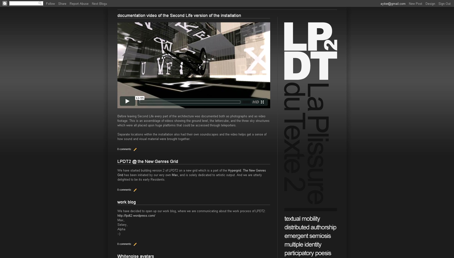
I have been meaning to try this out for quite some time, for a number of reasons: First off, it does get kind of boring to always have horizontal headers at the top of a website: The way in which a website is constructed vertical elements such as the columns do look very good. So, why not use the vertical components of the layout for design strategies, as well as a place for info elements such as labels and link lists?
And then also, web real estate: If you have the content starting all the way at the top of the page, you will be showing considerably more at first sight - obviously.
And then also, web real estate: If you have the content starting all the way at the top of the page, you will be showing considerably more at first sight - obviously.
I just made a website for an art project in which I am involved, and since the logotype of this is a square which works well when placed on a corner with the site description "dropping down" from it (so to speak), this seemed a very good opportunity to give the idea a shot.
Remember that before all else you will need to unlock the header widget! To find out how this is done read this post here >>>.
The template which I used is the one which I took from this site, except that I changed the layout and the number of columns, as well as their widths and proportions, so that the vertical header fit into the corner without looking cramped in. Needless to say the whole thing took a bit of aligning, which these days I do quite quickly by playing with the margin values, as is explained here >>>
See the result here:
Remember that before all else you will need to unlock the header widget! To find out how this is done read this post here >>>.
The template which I used is the one which I took from this site, except that I changed the layout and the number of columns, as well as their widths and proportions, so that the vertical header fit into the corner without looking cramped in. Needless to say the whole thing took a bit of aligning, which these days I do quite quickly by playing with the margin values, as is explained here >>>
See the result here:
.................................................................................................................................
Tuesday, 26 April 2011
is becoming a designer a matter of "talent"?
No, it is not, I would say.
What has brought on this post is that one of my students (a non-design major) has just let me know that she is dropping out of the class. It is the 9th week of the semester and it is her last chance to do so. Her reason is that she doesn't think that she has the talent for the job. I have tried to reason with her, however to no avail. She firmly believes that being able to put together a good website needs a special sort of talent, which she doesn't think that she has. Taking the class has made her realize that, she says.
Of course it does take what one might call a special talent if we are talking about the high end of design work: High powered art directors, visionary designers and typographers - these people do have a special something going for them, obviously. That said, anyone who has common sense, a sense of order and hierarchy, who takes the time to look at the design output of others and examines what they see critically, can develop a sense of good design. Or put differently, anyone who can put visual elements together into one continuous whole (which is something that most of us manage to pull off every morning when we get dressed) can become a competent designer.
Maybe not so before the days of the computer and the abundance of resources that it has brought to our doorstep. Back in the bad old days (which I am actually old enough to remember very well ;-), before all else you did need the ability to draw. Which, as far as I am concerned, is not exactly a talent either but a skill.
Maybe not so before the days of the computer and the abundance of resources that it has brought to our doorstep. Back in the bad old days (which I am actually old enough to remember very well ;-), before all else you did need the ability to draw. Which, as far as I am concerned, is not exactly a talent either but a skill.
Common sense - that is what this is mostly about folks. And resourcefulness! Not some undefinable something that goes under the name of talent! Having a sense of huge enjoyment whilst making the stuff. Getting excitement out of finding a resource that will help solve a visual problem. And then getting a real kick out of the satisfaction of the problem solved. Those would be the basic prerequisites, in my book. Once those are in place, "talent" will follow - and much sooner than you think! :-)
.................................................................................................................................
Wednesday, 13 April 2011
fine line between good web design & usability
As the technology advances, we get more and more freedom in how we design our websites. While this aspect allows creativity beyond imagination, it also creates dangerous pitfalls that should be avoided. First, you have to accept and understand that you are designing a web-page not a print (poster etc.), which is the most dangerous pitfall for beginner web designers especially for those with a graphic design background. (GripLimited; welcome to poster design 101, great typography but a ton of problems). Then, you have to think like a simple internet user, where will they look, what will they see, can they reach the desired information easily. Know that, not everyone will be as proficient as you are with internet browsing, nor will be able to see your website like you see it.
During the design process, there are mainly 5 issues that you have to be careful with. These are visual placement, visibility\accessibility, navigation, loading times\problems, categorizing\archiving (if used).
Below, I will try to give you some examples of what "NOT" to do. The selected sites are particularly well designed however due to one of the facts above, each suffers major problems in usability.
Visual Placement - or in this case Visual Mess:
This is what I would like to call hammering the visitor. I don't even understand what the page is about, nor where I should click.
Nicely done, but what am I looking at? There is so much going on, stuff moving on its own. It is impossible to understand what is a link and what isn't. A navigation disaster as well. Plus on smaller screens, it re-sizes itself, I can't even imagine browsing this site on a netbook.
Visibility\Accessiblity - or in this case Invisibility:
Incredibly fun and innovative design, yet an overkill due to the ridiculously big design. It gets tiresome to drag yourself around, not knowing what is where.
Innovative design and yet again too large for its own good, it is hard to understand what and where is content. Plus the site scrolls from bottom to top and the scroll is at the right bottom. Also too much content at one page, it takes quite long to load.
Navigation - how will I browse?:
Where to begin? This site is a lesson by itself. Disturbingly long load time, no proper menu (just a bunch of images that bring out names that don't mean anything). Slow and jagged transitions on images. Again more load times for new pages. And marvelously, you have to go to a new page to actually shut off the sound.
There was on thing that wasn't on Toyota's mind while designing this beautiful website, navigation. It is really unsatisfying going over those numbers on the bottom to actually see where they might be linked to.
Loading Times - lets face it, no one will care how beautiful your page is if it takes more than a minute or 2 to load. This is especially a problem with those who tend to use flash. In HTML, the only thing you have to be careful about is the size of the images you use. If you are crating a page with massive and high quality images, try to use pre-loading and loading screen javascripts to prevent partially and slowly appearing images. Even in this case, there is the same problem with flash, if you overdo it, it will take disturbingly long:
Along with no proper navigation, it also takes quite a while to load. Add to this, the fact that there is no way whatsoever of skipping the introduction animation and you get a beautiful and yet useless website.
Categorizing & Archiving - you have to create an intuitive interface so that the visitor can find what he/she is looking for easily... or maybe you don't as in the following cases:
This is the pillar of confusing categorization. Just click one of those stripes and see what happens, how could anyone find what they are looking for over there.
Another very confusing categorization, just move your mouse pointer to the right side of the page and you will see.
Finally...
I hope this gives you a good perspective on what to consider when designing for web. Good and innovative design is very important but overdoing it results in losing visitors which I guess no one would want.
.................................................................................................................................
Tuesday, 12 April 2011
using a blogspot template for a fast design job

I was asked to put together a fast and furious promotional design package for this upcoming event at our university. And what better way to do it than right here? Ultra-fast, ultra-clean and ultra-easy design solution!
What this approach has given me is an instant visual identity, complete with color scheme, typographic scheme, visual side elements (the thin strokes), and of course grid, layout and structure. Such a visual identity normally takes quite some time to put together, but it has turned out to be a cinch here. And once you have this in place, it is very easy to adapt it to other media as well, which is what I may need to do eventually.
What this approach has given me is an instant visual identity, complete with color scheme, typographic scheme, visual side elements (the thin strokes), and of course grid, layout and structure. Such a visual identity normally takes quite some time to put together, but it has turned out to be a cinch here. And once you have this in place, it is very easy to adapt it to other media as well, which is what I may need to do eventually.
I took the Ethereal template, which I have been wanting to play around with anyway, because of those really nice thin lines which you can have running at both sides of your content once you make the main background transparent and keep the border as a color. Added a dark gradient background, changed fonts and colors a bit - and not even all that much, to be honest. Only problem with this template is that you cannot modify the size of the blog description, unless you go into the code. However, that can very easily be fixed by importing the header text as a png file from photoshop. And here we are:
The organizers may also want a poster at some point. No problem! This is a perfectly aligned, well structured, ready to go layout in which all the visual hierarchies are correctly placed. (Not bragging or anything, nothing that I spent a lot of time figuring out, just works that way - the indigenous web format sees to all of that most efficiently ;-). So, as I already said before, this will adapt itself to other media quite easily. And, since almost everything here is text based there will be no major resizing issues either. All I will need to do therefore, is to print this page as a pdf, at an A2 size (or even larger), open it up in Illustrator, where all of the text will still be editable by the way. Delete whatever isn't working (which will be all the bitmap based stuff), clear the background and the header (again, both are bitmap and won't resize without some very serious loss of quality), and then copy paste the whole shebang into photoshop, which I vastly prefer to Illustrator as a design medium. Add the images, the background, the header and - you have a poster!
Or even change the format (portrait to landscape, different aspect ratios, etc), move the elements around, and you have a flier, an invitation, a brochure - whatever it is that you need really...
Or even change the format (portrait to landscape, different aspect ratios, etc), move the elements around, and you have a flier, an invitation, a brochure - whatever it is that you need really...
.................................................................................................................................
Sunday, 10 April 2011
playing around with free vectors and photoshop layer modes
The original vector file is here >>>
And here's what happened to it:
And here's what happened to it:


Read all about it (and also see other versions) here >>>
Download the photoshop file from here >>>
.................................................................................................................................
Monday, 4 April 2011
design: using photoshop plugins for website backgrounds and effects

geek.folk goes elegant ;-). This is to show you how to use photoshop plugins and filters to achieve effects on your background and header.
I didn't change much from the previous layout and even the glass buttons are still here, except that I applied a dark layer style to them this time.
On the background I used a plugin named Sinedots II, freely downloadable, courtesy of a very generous gentleman named Philipp Spoeth, who has been making this wonder available (PC only - ouch!) right here >>> for a very long time. Just place it in your plugins folder and the rest is fairly self-explanatory, although there are a few tutorials on it available on the download page as well. In this case I just applied the plugin onto the full canvas and then used a layer mask to delete the top and the bottom. Moved it up to where I wanted it to be, and that was that. In any case, this is such a beautiful filter that it would be kind of hard to go wrong with it no matter how you use it...
On the header, where I switched the font to Bauer Bodoni this time, I used the standard photoshop lens flare filter which is under Filters > Render. Now, here is the trick with that: It is actually quite difficult to get this to sit exactly where you want it to sit. What I do is, I create two layers in the same color, and then put the lens flare dead center in the middle of the top layer. Apply a gradient on a layer mask from all 4 sides (Tip: make sure you have the gradient colors going from solid black to transparent white, otherwise you will keep painting over what you are doing ) then move, rotate, resize the flare to exactly where you would like it to be - which in my case is behind the header text so that I get a nice highlight there to offset the dark typography.
(Note: If I were to actually make such a site, I would place the flare on the background, together with the sinedots effect, so that the content slides over it as the viewer scrolls downward).
(Note: If I were to actually make such a site, I would place the flare on the background, together with the sinedots effect, so that the content slides over it as the viewer scrolls downward).
And you can see everything that I did in the photoshop file which you can download from here >>>.
.................................................................................................................................
Tuesday, 29 March 2011
design tutorial: clean body text in your posts
I have made some deliberately unaligned body text and taken several snapshots which I combined for a tutorial. Looks really ugly folks! :-P:

To get to the tutorial, please click on the image and read the annotations.
.................................................................................................................................
Sunday, 27 March 2011
playing around with photoshop layer styles

I downloaded the styles mostly from 22 pixels, however I may have looked elsewhere too. Just pull in a whole bunch and put them in the styles folder under photoshop presets. Then click on the little right arrow at the top of the styles palette in photoshop to load them. And my advice is to leave their values more or less as they are. It is quite easy to lose the effect altogether if you start tweaking them too much. I used the vector shape tool and I also installed a few dingbat fonts since layer styles seem to work especially nicely with shapes. (The two circle arrows on the right are in fact dingbats).
Only other thing I did was that I added a little divider line between the menu items. A tiny little vertical 1 pixel grey stroke and then gave that a motion blur at 90 degrees exactly, so that it faded out at both ends.
And the photoshop file, where you can also see how I aligned the stuff, is here:
.................................................................................................................................
Friday, 25 March 2011
being "resource-ful": site layout with ready made visual components


Read all about it here ;-)
Get the photoshop file here:
http://www.citrinitas.com/easy-peasy/geek-folk.zip
.................................................................................................................................
Tuesday, 22 March 2011
clean typography for website headers

I am not sure that what is shown above even needs much further explanation.
Clean typography, plenty of space, the usage of one strong color together with a lot of neutral ones such as grays, black and white - and you are more or less home and dry.
Clean typography, plenty of space, the usage of one strong color together with a lot of neutral ones such as grays, black and white - and you are more or less home and dry.
There will of course be occasions when the content of your site will necessitate that you use a company logotype or some sort of extra visual indicator on what the site is all about. But even then clean solutions will usually work much better since a website gives you a very small area to work on and things will usually end up being be placed very close together to begin with; so wherever you can be clean and simple it is good practice to go for it.
One thing web designers make a lot of usage of however are all the stylistic details which they use to enhance their work, by giving it a dimensionality which makes elements stand out from the page. When you look at the ones above you will notice that there are very few where the design elements have been placed on the page "as is". They have been worked upon with bevels, drop shadows, delicate touches, soft gradients, ultra thin strokes, and so on. Never overboard, never exaggerated, never so that it becomes coarse but very very carefully - almost like as if these designers are jewelers, working very patiently on exquisite ornaments or watches. This is something that I would encourage you to do as well.
Getting the exact right balance for these types of details is not so easy however. A lot of them are created with the layer styles in photoshop, but all I can say is that whenever I try my hand at doing something like this I cannot pull it off. I rarely manage to get something that has this level of refinement. So, my advice would be to use pre-created layer styles. A good selection can be downloaded from WebTreats. And here are a few other good places also:
.................................................................................................................................
Monday, 21 March 2011
design tutorial: aligning a header
Alignment (and also deliberate non-alignment) is one of the foremost principles of good graphic design since alignment is how one of the fundamental Gestalt principles, continuity works. In the previous post we were looking at visual continuity and alignment is very much a part of that as well.
HTML web design is done in two places: One of them is an image editor and the other one is an HTML editor. And we need to be able to switch back and forth between them and also be able to carry values from one to the other. Meaning that we often need to make things work together although they are located in different places while we are still working on them. So, we need to be able to visualize how things will look, even at a point where we cannot yet see them together as a whole system.
In terms of alignment the good news is that on an HTML website most things are aligned by default since the underlying structure is based upon a table, very much like an excel sheet, in fact. (Only exceptions are the elements that are made out of images which you import into the cells - such as the header!).
When you design a website you will usually start out in an image editor and then adjust the alignment of the table cells in the HTML editor according to what you initially did in the image editor. However, you can also work in reverse and start out with the HTML editor and go back to the image editor from there. And the really good news is that the template editor at blogspot makes it exceptionally easy to do so.
When you design a website you will usually start out in an image editor and then adjust the alignment of the table cells in the HTML editor according to what you initially did in the image editor. However, you can also work in reverse and start out with the HTML editor and go back to the image editor from there. And the really good news is that the template editor at blogspot makes it exceptionally easy to do so.
So, go to the template editor and temporarily put a black (or white - depending upon your template colors) image on the background. All black or white - a tiny square which you tile. Then go to the blog title gadget in Design and delete everything. We want the top, the header area to be completely blank, in other words. Now take a snapshot of the site and then open it in the image editor.

Place guides at the edges of the gadget lines (or whatever it is that you have on your site that needs to be taken into account for alignment purposes), the post lines, the text columns. Anything that you see that you think will be important when aligning things. Now start putting in the design elements of your header, always keeping an eye on the guides.
Below I am showing you a few examples, both good and bad. In all of them you will see the text both with the guides and without them to help make things even clearer:
Below I am showing you a few examples, both good and bad. In all of them you will see the text both with the guides and without them to help make things even clearer:

The first one is made up of two long sentences for title and sub title, where the top one is aligned to the text of the left hand gadget column and the lines of the right hand column. And then additionally the blue letter 'P' is also aligned to the post column. The sub title aligns to the lines of the right hand gadget column but also to the text of the post column. I have used the text column for the left hand side since this is a much stronger element than the thin lines. On the right however it is better to align to the lines since the text column there is ragged on the right hand side and doesn't give you much to go by.

In the second one I am keeping the title as it is but I am now making a little paragraph out of the sub title which I am aligning to the post column as well.

In the third one I am taking the sub title and aligning it to the vertical stroke of the 'D' of the word design. So, in this case I am no longer looking at the template but at the relationships within the header itself. Except - I still have an eye on the template guides since I would not want for the sub title to get placed without a good relationship to the guides either. In this case this would be all about getting not too close to them! The trick with alignment is that it is perfectly OK to be unaligned provided that you are really and truly unaligned! The death sentence comes when you are close but not exact. When your placement is "ambiguous" in other words. As the following example will show you:

Here the trouble is that the placement of the sub title is completely arbitrary, of course.

However sometimes things can go wrong even with the best of intentions. In this one I did not place the sub title arbitrarily, I actually aligned it to the stem of the letter 'Y' in the word 'Easy'. Problem is that I was not paying attention to the guides of the template and so I ended up being way too close to the post guides, which is the much stronger element.
(Tip: Always align things to the strongest element between two that are closely situated, never the weaker one! )
(Tip: Always align things to the strongest element between two that are closely situated, never the weaker one! )

In the final example I am showing you the sub title placed in such a way that it is no longer close to any of the guides or the vertical strokes of the letters. And this works too since I am making an unambiguous statement here. It is when you get caught in the middle that things will go to hell... :-)

And finally - once you are done, crop your image to the exact size, which will be your outer guides and upload as header image.
Even with all of this hard work, you may still end up not getting it completely right. In that case help is also at hand within blogspot: Copy paste the following code into the CSS box inside the Advanced tab of the Template Editor and play with the value highlighted in black:
#header img {
margin-left: 0px;
}
Even with all of this hard work, you may still end up not getting it completely right. In that case help is also at hand within blogspot: Copy paste the following code into the CSS box inside the Advanced tab of the Template Editor and play with the value highlighted in black:
#header img {
margin-left: 0px;
}
(Also remember: If you want floating elements and not a box, close the eye of the background and all unwanted layers before you save as a 24 bit png. )
.................................................................................................................................
design: creating visual continuity
Time for a design tutorial now! ;-)
We shall be doing this by examining the structure and visual continuity of a professionally designed website template called 'boomerang 3D' from http://www.dreamtemplate.com/
We shall be doing this by examining the structure and visual continuity of a professionally designed website template called 'boomerang 3D' from http://www.dreamtemplate.com/
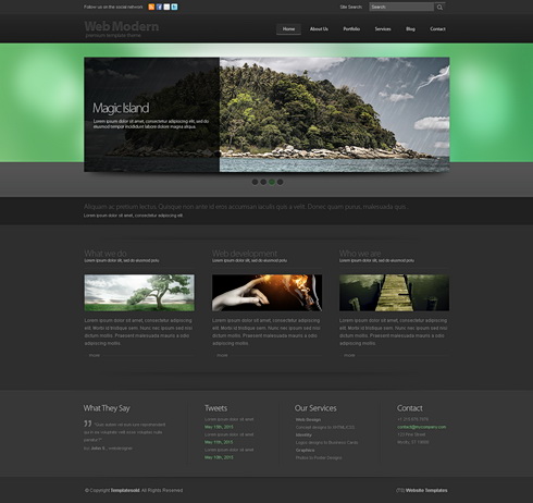
HTML websites have a big advantage in terms of visual continuity since the structure of a site (header / menu / content) inherently provide for this. (Read more on website structure here).
When we design something we are actually creating a system. Not something that is good looking in its separate components but something that works together as a whole. So, when we are putting together visual elements we should not be making random decisions but always be thinking about whether the elements that we are deciding upon will work with everything else that we put next to them. There may be nice things that we see or think of, but if they do not serve the structure of the whole page we simply bookmark them for possible usage later, in some new project, but leave them alone for now since they will not work with the whole system.
In graphic design this system is made up of type, images, shapes and colors. And the usage all of these 4 components should be consistent. As an example, if you are using rounded rectangle shapes in the header of your page there should be rounded rectangles elsewhere as well - maybe buttons, or post backgrounds. Your typography should consist of a small selection of fonts that work well together and your type should always align in the same way. Your images should reflect a common color scheme (like they could all be black & white, or all color, or all colorized) and also how you crop an image may be quite important: If you sometimes crop images like squares and at other times like vertical rectangles and then sometimes as horizontal rectangles, it may well end up becoming visually inconsistent.
Now let us look at 'boomerang 3D' a bit more closely:
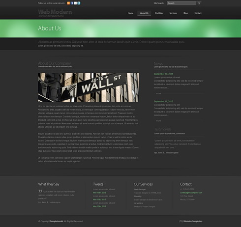
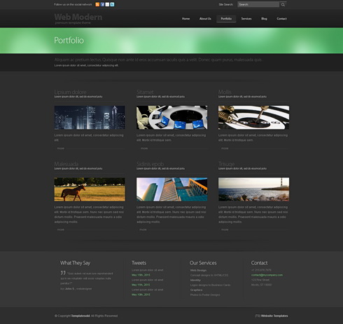
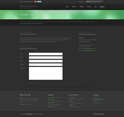
The obvious place to start out with any graphic design work is typography: In terms of graphical hierarchy type is always the number 1 element since it actually conveys the "spoken" information, which is of course the most important thing. Here the visual continuity in which type has been used is obvious - one font only, everything aligned flush left. Always a title above the images, with a sub-title to follow and then the body text below the image. And even when there is no image (such as on the 'contact us' page at the bottom), the same principle has been applied: Again title, closely followed by a subtitle, then an empty space - and then the actual body text.
However although type is very important, one of the first things that strikes me when I look at this template is the way in which how all of the images have been cropped to form long narrow horizontal rectangles. This usage is possibly the most important continuous visual element and it adds hugely to the effectiveness of this site.
But here is the really clever thing which was done here: These narrow images are actually a sub-system, or a mini version of the larger system into which they are embedded. If you look carefully you will see that the whole layout consists of long, narrow, horizontal rectangles, starting from the green band in the header at the top, down to the long and narrow menu at the bottom. Even the form on the "contact us" page has long narrow entry fields instead of the usual chunky ones. And then there are long bands of darker gray that break up the layout horizontally as well. And almost nowhere do we see a strong vertical break - except in one place, the "about us" page where the left column is set wide enough and there is also sufficient space between the two columns for this to become quite unobtrusive.
One seeming inconsistency might be the fact that the green blur is much broader on the homepage than on the rest of the site. This has been done so that the homepage differentiates itself from the rest, of course. However, in the end there is no real inconsistency anyway since the relationship that is lost in the height of the shape is more than made up through a color which is powerful enough to pull this off.
And speaking of color - fairly self evident: They use one strong color together with lots of grays and always full color images.
But here is the really clever thing which was done here: These narrow images are actually a sub-system, or a mini version of the larger system into which they are embedded. If you look carefully you will see that the whole layout consists of long, narrow, horizontal rectangles, starting from the green band in the header at the top, down to the long and narrow menu at the bottom. Even the form on the "contact us" page has long narrow entry fields instead of the usual chunky ones. And then there are long bands of darker gray that break up the layout horizontally as well. And almost nowhere do we see a strong vertical break - except in one place, the "about us" page where the left column is set wide enough and there is also sufficient space between the two columns for this to become quite unobtrusive.
One seeming inconsistency might be the fact that the green blur is much broader on the homepage than on the rest of the site. This has been done so that the homepage differentiates itself from the rest, of course. However, in the end there is no real inconsistency anyway since the relationship that is lost in the height of the shape is more than made up through a color which is powerful enough to pull this off.
And speaking of color - fairly self evident: They use one strong color together with lots of grays and always full color images.
Very clever! Very effective! Very elegant!
.................................................................................................................................
Subscribe to:
Posts (Atom)

