Showing posts with label Gestalt. Show all posts

Sunday, 10 April 2011

playing around with free vectors and photoshop layer modes

The original vector file is here >>>
And here's what happened to it:


Read all about it (and also see other versions) here >>>
Download the photoshop file from here >>>

.................................................................................................................................

Monday, 21 March 2011

design tutorial: aligning a header

Alignment (and also deliberate non-alignment) is one of the foremost principles of good graphic design since alignment is how one of the fundamental Gestalt principles, continuity works. In the previous post we were looking at visual continuity and alignment is very much a part of that as well.

HTML web design is done in two places: One of them is an image editor and the other one is an HTML editor. And we need to be able to switch back and forth between them and also be able to carry values from one to the other. Meaning that we often need to make things work together although they are located in different places while we are still working on them. So, we need to be able to visualize how things will look, even at a point where we cannot yet see them together as a whole system.

In terms of alignment the good news is that on an HTML website most things are aligned by default since the underlying structure is based upon a table, very much like an excel sheet, in fact. (Only exceptions are the elements that are made out of images which you import into the cells - such as the header!).

When you design a website you will usually start out in an image editor and then adjust the alignment of the table cells in the HTML editor according to what you initially did in the image editor. However, you can also work in reverse and start out with the HTML editor and go back to the image editor from there. And the really good news is that the template editor at blogspot makes it exceptionally easy to do so.

So, go to the template editor and temporarily put a black (or white - depending upon your template colors) image on the background. All black or white - a tiny square which you tile. Then go to the blog title gadget in Design and delete everything. We want the top, the header area to be completely blank, in other words. Now take a snapshot of the site and then open it in the image editor.


Place guides at the edges of the gadget lines (or whatever it is that you have on your site that needs to be taken into account for alignment purposes), the post lines, the text columns. Anything that you see that you think will be important when aligning things. Now start putting in the design elements of your header, always keeping an eye on the guides.

Below I am showing you a few examples, both good and bad. In all of them you will see the text both with the guides and without them to help make things even clearer:


The first one is made up of two long sentences for title and sub title, where the top one is aligned to the text of the left hand gadget column and the lines of the right hand column. And then additionally the blue letter 'P' is also aligned to the post column. The sub title aligns to the lines of the right hand gadget column but also to the text of the post column. I have used the text column for the left hand side since this is a much stronger element than the thin lines. On the right however it is better to align to the lines since the text column there is ragged on the right hand side and doesn't give you much to go by.


In the second one I am keeping the title as it is but I am now making a little paragraph out of the sub title which I am aligning to the post column as well.


In the third one I am taking the sub title and aligning it to the vertical stroke of the 'D' of the word design. So, in this case I am no longer looking at the template but at the relationships within the header itself. Except - I still have an eye on the template guides since I would not want for the sub title to get placed without a good relationship to the guides either. In this case this would be all about getting not too close to them! The trick with alignment is that it is perfectly OK to be unaligned provided that you are really and truly unaligned! The death sentence comes when you are close but not exact. When your placement is "ambiguous" in other words. As the following example will show you:


Here the trouble is that the placement of the sub title is completely arbitrary, of course.


However sometimes things can go wrong even with the best of intentions. In this one I did not place the sub title arbitrarily, I actually aligned it to the stem of the letter 'Y' in the word 'Easy'. Problem is that I was not paying attention to the guides of the template and so I ended up being way too close to the post guides, which is the much stronger element.

 (Tip:  Always align things to the strongest element between two that are closely situated, never the weaker one!  ) 


In the final example I am showing you the sub title placed in such a way that it is no longer close to any of the guides or the vertical strokes of the letters. And this works too since I am making an unambiguous statement here. It is when you get caught in the middle that things will go to hell... :-)


And finally - once you are done, crop your image to the exact size, which will be your outer guides and upload as header image.

Even with all of this hard work, you may still end up not getting it completely right. In that case help is also at hand within blogspot: Copy paste the following code into the CSS box inside the Advanced tab of the Template Editor and play with the value highlighted in black:

#header img {
margin-left: 0px;
}

 (Also remember:  If you want floating elements and not a box, close the eye of the background and all unwanted layers before you save as a 24 bit png.  ) 

.................................................................................................................................

design: creating visual continuity

Time for a design tutorial now! ;-)

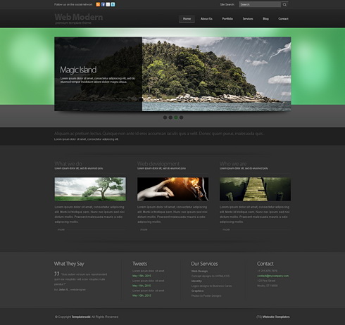
We shall be doing this by examining the structure and visual continuity of a professionally designed website template called 'boomerang 3D' from http://www.dreamtemplate.com/


HTML websites have a big advantage in terms of visual continuity since the structure of a site (header / menu / content) inherently provide for this. (Read more on website structure here).

When we design something we are actually creating a system. Not something that is good looking in its separate components but something that works together as a whole. So, when we are putting together visual elements we should not be making random decisions but always be thinking about whether the elements that we are deciding upon will work with everything else that we put next to them. There may be nice things that we see or think of, but if they do not serve the structure of the whole page we simply bookmark them for possible usage later, in some new project, but leave them alone for now since they will not work with the whole system.

In graphic design this system is made up of type, images, shapes and colors. And the usage all of these 4 components should be consistent. As an example, if you are using rounded rectangle shapes in the header of your page there should be rounded rectangles elsewhere as well - maybe buttons, or post backgrounds. Your typography should consist of a small selection of fonts that work well together and your type should always align in the same way. Your images should reflect a common color scheme (like they could all be black & white, or all color, or all colorized) and also how you crop an image may be quite important: If you sometimes crop images like squares and at other times like vertical rectangles and then sometimes as horizontal rectangles, it may well end up becoming visually inconsistent.

Now let us look at 'boomerang 3D' a bit more closely:


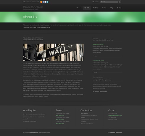
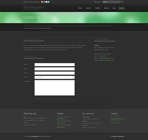
The obvious place to start out with any graphic design work is typography: In terms of graphical hierarchy type is always the number 1 element since it actually conveys the "spoken" information, which is of course the most important thing. Here the visual continuity in which type has been used is obvious - one font only, everything aligned flush left. Always a title above the images, with a sub-title to follow and then the body text below the image. And even when there is no image (such as on the 'contact us' page at the bottom), the same principle has been applied: Again title, closely followed by a subtitle, then an empty space - and then the actual body text. 

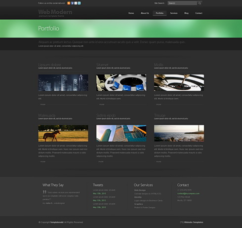
However although type is very important, one of the first things that strikes me when I look at this template is the way in which how all of the images have been cropped to form long narrow horizontal rectangles. This usage is possibly the most important continuous visual element and it adds hugely to the effectiveness of this site.

But here is the really clever thing which was done here: These narrow images are actually a sub-system, or a mini version of the larger system into which they are embedded. If you look carefully you will see that the whole layout consists of long, narrow, horizontal rectangles, starting from the green band in the header at the top, down to the long and narrow menu at the bottom. Even the form on the "contact us" page has long narrow entry fields instead of the usual chunky ones. And then there are long bands of darker gray that break up the layout horizontally as well. And almost nowhere do we see a strong vertical break - except in one place, the "about us" page where the left column is set wide enough and there is also sufficient space between the two columns for this to become quite unobtrusive.

One seeming inconsistency might be the fact that the green blur is much broader on the homepage than on the rest of the site. This has been done so that the homepage differentiates itself from the rest, of course. However, in the end there is no real inconsistency anyway since the relationship that is lost in the height of the shape is more than made up through a color which is powerful enough to pull this off.

And speaking of color - fairly self evident: They use one strong color together with lots of grays and always full color images.

Very clever! Very effective! Very elegant!

.................................................................................................................................

Sunday, 6 March 2011

design stuff: background images

A few useful hints on how to choose background images:

Your design will go in one of two directions: You will either have boxes inside of which you place your content or you will do a free floating layout, such as the one you see here on the easy peasy site. These are two distinct approaches which will also determine your background images. If you have things boxed then you can be far more adventuresome with your background since the boxes will see to it that the content of your site stands apart from whatever it is that is going on behind them. If you go for the free floating look however, then the background will need to have very very low contrast, it really needs to go all the way back, so that it doesn't interfere with your content, be it images or text.

However, even if you have boxes, it may still be a good idea to consider what sorts of visual material will be part of the actual content later on. If you plan on using lots of really colorful images then it may still be a good thing to have a background which will not interfere with that. If, on the other hand, your content is mostly text based with relatively few images, or always low saturated ones - then it may be a really good idea to have a strong background.


I created a dummy site for this course, so that I can show examples of what I am talking about without ruining the real thing. Here, I put boxes underneath the content and then placed very high contrast black and white images into the background. Since the boxes create enough of a separator this does seem to work.

Another thing is the subject matter itself: Going back to the scuba diving website which one class member is thinking of doing. In all likelihood most of his images will be underwater photographs and so forth. In which case a nice deep sea image, or an abstract image in strong blue hues will probably look really good as a background for that.

A word which you will hear me say a lot over the next weeks is Gestalt. Essentially what this means is that any design work has to be considered as a whole, every visual component has to be related to everything else through closure, through alignment, proximity, similarity etc. So, the background is only one component of a complex system which we will be building together. The good news is that in web design you can always go back and adjust things, change things, add and delete things if they are not working out. That said, it is still good work practice to think about future visual relations as you are putting some thought into a background for your website now.

................................................................................................................................
Girls Generation - Korean