Showing posts with label Layout. Show all posts

Saturday, 30 April 2011

design: making a vertical header


I have been meaning to try this out for quite some time, for a number of reasons: First off, it does get kind of boring to always have horizontal headers at the top of a website: The way in which a website is constructed vertical elements such as the columns do look very good. So, why not use the vertical components of the layout for design strategies, as well as a place for info elements such as labels and link lists?

And then also, web real estate: If you have the content starting all the way at the top of the page, you will be showing considerably more at first sight - obviously.

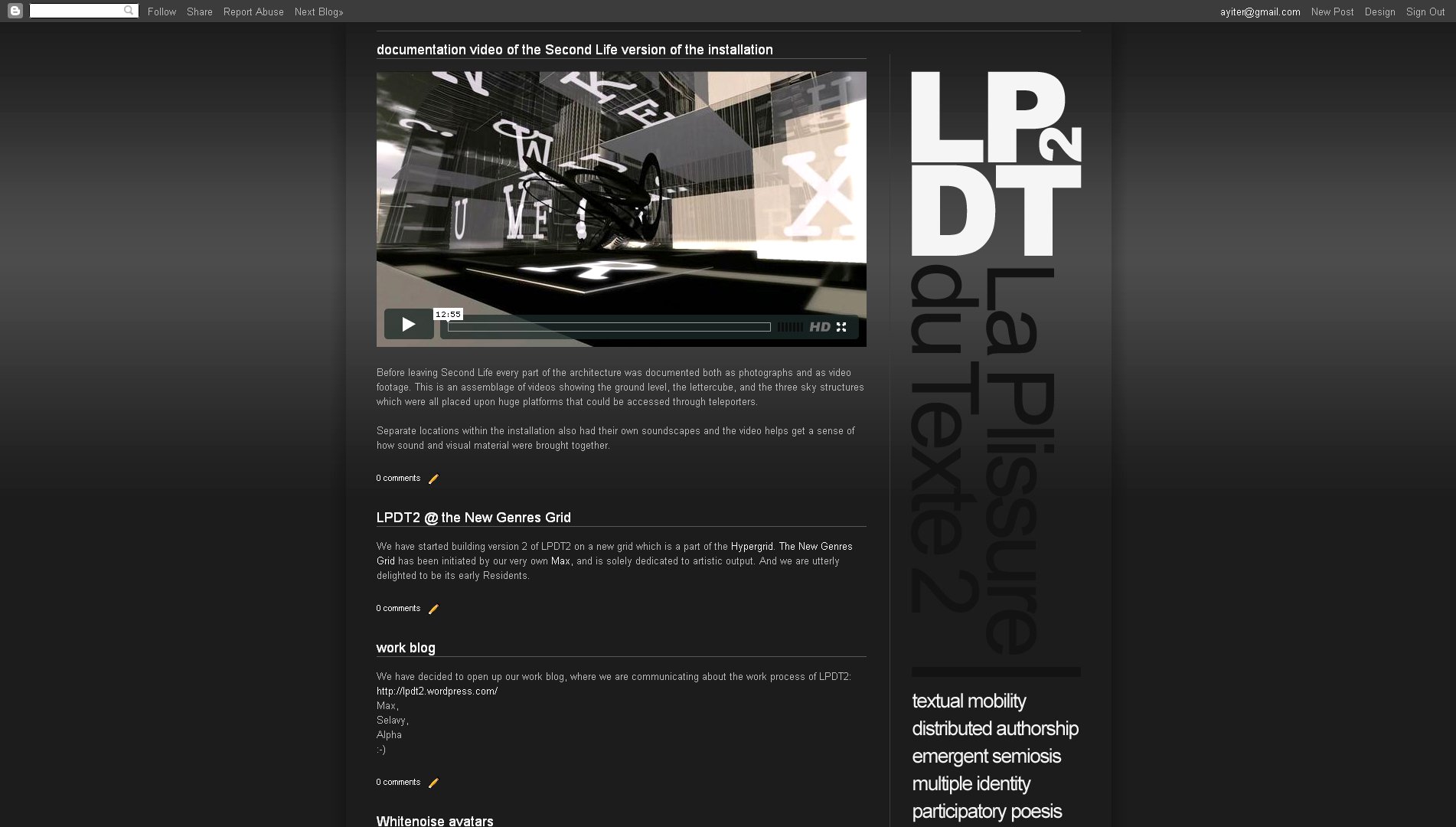
I just made a website for an art project in which I am involved, and since the logotype of this is a square which works well when placed on a corner with the site description "dropping down" from it (so to speak), this seemed a very good opportunity to give the idea a shot.

Remember that before all else you will need to unlock the header widget! To find out how this is done read this post here >>>.

The template which I used is the one which I took from this site, except that I changed the layout and the number of columns, as well as their widths and proportions, so that the vertical header fit into the corner without looking cramped in. Needless to say the whole thing took a bit of aligning, which these days I do quite quickly by playing with the margin values, as is explained here >>>

See the result here:

.................................................................................................................................

Tuesday, 12 April 2011

using a blogspot template for a fast design job


I was asked to put together a fast and furious promotional design package for this upcoming event at our university. And what better way to do it than right here? Ultra-fast, ultra-clean and ultra-easy design solution!

What this approach has given me is an instant visual identity, complete with color scheme, typographic scheme, visual side elements (the thin strokes), and of course grid, layout and structure. Such a visual identity normally takes quite some time to put together, but it has turned out to be a cinch here. And once you have this in place, it is very easy to adapt it to other media as well, which is what I may need to do eventually.

I took the Ethereal template, which I have been wanting to play around with anyway, because of those really nice thin lines which you can have running at both sides of your content once you make the main background transparent and keep the border as a color. Added a dark gradient background, changed fonts and colors a bit  - and not even all that much, to be honest. Only problem with this template is that you cannot modify the size of the blog description, unless you go into the code. However, that can very easily be fixed by importing the header text as a png file from photoshop. And here we are:

The organizers may also want a poster at some point. No problem! This is a perfectly aligned, well structured, ready to go layout in which all the visual hierarchies are correctly placed. (Not bragging or anything, nothing that I spent a lot of time figuring out, just works that way - the indigenous web format sees to all of that most efficiently ;-). So, as I already said before, this will adapt itself to other media quite easily. And, since almost everything here is text based there will be no major resizing issues either. All I will need to do therefore, is to print this page as a pdf, at an A2 size (or even larger), open it up in Illustrator, where all of the text will still be editable by the way. Delete whatever isn't working (which will be all the bitmap based stuff), clear the background and the header (again, both are bitmap and won't resize without some very serious loss of quality), and then copy paste the whole shebang into photoshop, which I vastly prefer to Illustrator as a design medium. Add the images, the background, the header and - you have a poster!

Or even change the format (portrait to landscape, different aspect ratios, etc), move the elements around, and you have a flier, an invitation, a brochure - whatever it is that you need really...

.................................................................................................................................

Wednesday, 30 March 2011

playing with blogspot widgets (gadgets)

As we have talked in the class last week, it is possible to separately edit every widget, give them different backgrounds, alignments, borders, colors, fonts etc. Here is how you do it:

The "widget id" is the only thing you need to edit the widget, but first you need to find it of course. To find the ID of the gadget you wish to modify, please read this previous post here.

Now go into the HTML editor, into the CSS part and find the section entitled "Widgets", then scroll down to the end of the section, just above the part where "Posts" section starts. In other words search for this line:
* /Posts
----------------------------------------------- */
And then all you have to do is; add the code given below straight above this line. The word Label1 in the topmost line, which is highlighted in black, is what you replace with the ID that you have found in the way described in the above linked post.

#Label1{
margin-top:20px
padding-left: 5px;
background:#ddddd;
font-family:arial, sans-serif;
font-size:11px;
text-align:left;
color: #db4c46;
};

The styles I have used are just for example, you can use as many or as few as you wish.

.................................................................................................................................

Friday, 25 March 2011

Monday, 21 March 2011

design: creating visual continuity

Time for a design tutorial now! ;-)

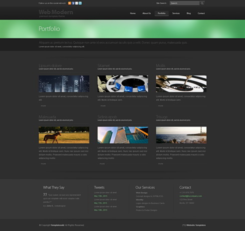
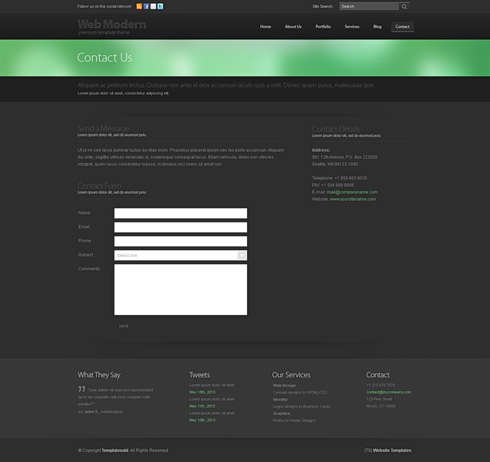
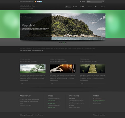
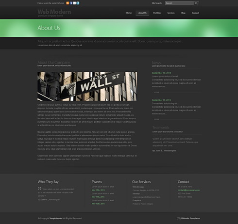
We shall be doing this by examining the structure and visual continuity of a professionally designed website template called 'boomerang 3D' from http://www.dreamtemplate.com/


HTML websites have a big advantage in terms of visual continuity since the structure of a site (header / menu / content) inherently provide for this. (Read more on website structure here).

When we design something we are actually creating a system. Not something that is good looking in its separate components but something that works together as a whole. So, when we are putting together visual elements we should not be making random decisions but always be thinking about whether the elements that we are deciding upon will work with everything else that we put next to them. There may be nice things that we see or think of, but if they do not serve the structure of the whole page we simply bookmark them for possible usage later, in some new project, but leave them alone for now since they will not work with the whole system.

In graphic design this system is made up of type, images, shapes and colors. And the usage all of these 4 components should be consistent. As an example, if you are using rounded rectangle shapes in the header of your page there should be rounded rectangles elsewhere as well - maybe buttons, or post backgrounds. Your typography should consist of a small selection of fonts that work well together and your type should always align in the same way. Your images should reflect a common color scheme (like they could all be black & white, or all color, or all colorized) and also how you crop an image may be quite important: If you sometimes crop images like squares and at other times like vertical rectangles and then sometimes as horizontal rectangles, it may well end up becoming visually inconsistent.

Now let us look at 'boomerang 3D' a bit more closely:


The obvious place to start out with any graphic design work is typography: In terms of graphical hierarchy type is always the number 1 element since it actually conveys the "spoken" information, which is of course the most important thing. Here the visual continuity in which type has been used is obvious - one font only, everything aligned flush left. Always a title above the images, with a sub-title to follow and then the body text below the image. And even when there is no image (such as on the 'contact us' page at the bottom), the same principle has been applied: Again title, closely followed by a subtitle, then an empty space - and then the actual body text. 

However although type is very important, one of the first things that strikes me when I look at this template is the way in which how all of the images have been cropped to form long narrow horizontal rectangles. This usage is possibly the most important continuous visual element and it adds hugely to the effectiveness of this site.

But here is the really clever thing which was done here: These narrow images are actually a sub-system, or a mini version of the larger system into which they are embedded. If you look carefully you will see that the whole layout consists of long, narrow, horizontal rectangles, starting from the green band in the header at the top, down to the long and narrow menu at the bottom. Even the form on the "contact us" page has long narrow entry fields instead of the usual chunky ones. And then there are long bands of darker gray that break up the layout horizontally as well. And almost nowhere do we see a strong vertical break - except in one place, the "about us" page where the left column is set wide enough and there is also sufficient space between the two columns for this to become quite unobtrusive.

One seeming inconsistency might be the fact that the green blur is much broader on the homepage than on the rest of the site. This has been done so that the homepage differentiates itself from the rest, of course. However, in the end there is no real inconsistency anyway since the relationship that is lost in the height of the shape is more than made up through a color which is powerful enough to pull this off.

And speaking of color - fairly self evident: They use one strong color together with lots of grays and always full color images.

Very clever! Very effective! Very elegant!

.................................................................................................................................
Saturday, 12 March 2011

design: hierarchy / text / lightness values


Since a website usually has very little white space (space which is empty of informational content, that is) the hierarchical components of a site will often end up being placed very close to one another. 

The two images above should hopefully explain it: If you make all of your text one color (white in this case), it will be quite difficult for people to know where to look first when they come to your site. If however, you use various tones of gray then it will become far more obvious where the most important stuff is, and then what comes after that. As a rule, things on the side bars are less important than your post, these should be darker than the post. Inside those, visited links are less important than unvisited ones, and the rollover link should pop out the most.

Inside the post itself it is a good idea to highlight or make bold the stuff which you would like to stand out. (I prefer highlight since I do not like the way bold text looks on websites at small sizes - becomes smudgy).

Size is also an element that can be used for establishing visual hierarchies, however since most of the text will have to be on the small side you can only really use that for post titles and the header: When it comes to body text, a change from 13 pixels to 14 or 15 is not going to give you enough difference and will only make your design look 'ambiguous' - a term which designers fear like death! So, tonal values for type hierarchies are one of the best ways to go in web design, I think.

.................................................................................................................................
Girls Generation - Korean