Showing posts with label Background. Show all posts

Thursday, 5 May 2011

semi-transparent and/or image background for all posts in blogspot

This is a step by step tutorial for creating a transparent/image background for the entire main posts section.

1- Creating a transparent .png:
Create a new photoshop (or whichever program you are using) file with 16x16 or 32x32 size, 72 resolution and tranparent background. Fill it with the color you wish to use, then change the opacity of the layer to a desired amount (a value between 70 to 90 is optimal). Save it for Web & Devices, making sure you have png24 and transparency selected. Now, upload it to somewhere (picasa etc.), so that you can have an url of the image which we will need later.

2- Template Designer:
Navigate to your blogger account's template designer tab. Select Advanced, here depending on your blogger template you will either have "Post Background" or "Background", first look for Post Background if you don't have it, select the other one.

For people with Post Background
From the color picker of Background Color, put a tick to transparent. If you don't want borders, do the same for Border Color.

For people with Background
From the color picker of Main Background, put a tick to transparent.

Finally apply to blog.
3- Edit HTML
Under the Edit HTML tab, look for this piece of code,

For people with Post Background in the previous step,
find,
.date-outer {
in it there is a line like this,
background-color: $(post.background.color);
replace it with this line changing the "image_url" with the actual url of your image
background: url(image_url) repeat;

For people with Background in the previous step,
find,
$(content.background.color.selector) {
in it there is a line like this,
background-color: $(content.background.color);
replace it with the following changing the "image_url" with the actual url of your image
background: url(image_url) repeat;

.................................................................................................................................

Monday, 4 April 2011

design: using photoshop plugins for website backgrounds and effects


geek.folk goes elegant ;-). This is to show you how to use photoshop plugins and filters to achieve effects on your background and header.

I didn't change much from the previous layout and even the glass buttons are still here, except that I applied a dark layer style to them this time.

On the background I used a plugin named Sinedots II, freely downloadable, courtesy of a very generous gentleman named Philipp Spoeth, who has been making this wonder available (PC only - ouch!) right here >>> for a very long time. Just place it in your plugins folder and the rest is fairly self-explanatory, although there are a few tutorials on it available on the download page as well. In this case I just applied the plugin onto the full canvas and then used a layer mask to delete the top and the bottom. Moved it up to where I wanted it to be, and that was that. In any case, this is such a beautiful filter that it would be kind of hard to go wrong with it no matter how you use it...

On the header, where I switched the font to Bauer Bodoni this time, I used the standard photoshop lens flare filter which is under Filters > Render. Now, here is the trick with that: It is actually quite difficult to get this to sit exactly where you want it to sit. What I do is, I create two layers in the same color, and then put the lens flare dead center in the middle of the top layer. Apply a gradient on a layer mask from all 4 sides  (Tip:  make sure you have the gradient colors going from solid black to transparent white, otherwise you will keep painting over what you are doing  )  then move, rotate, resize the flare to exactly where you would like it to be - which in my case is behind the header text so that I get a nice highlight there to offset the dark typography.

(Note: If I were to actually make such a site, I would place the flare on the background, together with the sinedots effect, so that the content slides over it as the viewer scrolls downward).

And you can see everything that I did in the photoshop file which you can download from here >>>.

.................................................................................................................................

Wednesday, 30 March 2011

backgrounds: one size fits all

Here is what to do if you want to have a background image that will automatically re-size itself according to the browser windows size (thus also for different screen resolutions).

First off be sure to get a nice large image around 16:9 ratio size having preferably 1900 px width, reduce its size (not in pixels, as in kbs) so it is not larger than 300-450 kbs(even this is too large but it will do).

Then upload it to someplace where you can have a direct link to it.

Finally go into "Edit HTML" from the design tab. Find "body {" in the css section. (just searching that quote without the quotes will get you there if you can't see it). It will most likely look something like this:

body {
  font: $(body.font);
  color: $(body.text.color);
  background: $(body.background);
}

Now, replace this part;
background: $(body.background);
with this;
background: url(http://www.yoururl.com/your_image.jpg) no-repeat center center fixed;
-webkit-background-size: cover;
-moz-background-size: cover;
-o-background-size: cover;
background-size: cover;

You should have something like this as the final result;
body {
  font: $(body.font);
  color: $(body.text.color);
  background: url(http://www.yoururl.com/your_image.jpg) no-repeat center center fixed;
  -webkit-background-size: cover;
  -moz-background-size: cover;
  -o-background-size: cover;
  background-size: cover;
}

This will work in most of the latest versions of known browsers.

.................................................................................................................................

Thursday, 24 March 2011

chaoscope: a great application to create website backgrounds

Download and play! :-D


http://www.chaoscope.org/

 (Tip:   Start out with the stuff from the projects folder and take it from there. Pick different fractal formula from the very top of the panel. Choose different render modes. Drag your cursor to rotate the fractal. F3 makes a new shape, F4 renders it for you. Also remember to click on the gradients at the bottom to get random color schemes. 

.................................................................................................................................

Saturday, 19 March 2011

can you resize a full background image on an HTML/CSS website?...

... one of my students wanted to know last week. Well, seems that you can:
And you can see a demo of it in action here:

Apparently this works with just a few lines of code which you insert directly into the CSS:

#img.source-image {
width: 100%;
position: absolute;
top: 0;
left: 0;
}

Very very nice indeed! Lots and lots of other really cool code snippets (as they call them over there) to check out on their huge site. So, thank you Chris Coyier and CSS-Tricks!

 Note:  I have been thinking, and in order for this to give a good result your image aspect ratio would need to be 4 x 3 so that it reaches down effectively at sizes like 1024 x 768 or 1600 x 1200. However the width would need still need to be 1920 so that it also stretches to 1920 x 1080. Which makes the vertical value 1440. So, 1920 x 1440 is what you need. Which is pretty big and may be difficult to bring down to 300KB, which is the limit on blogspot background images. Read more on browser sizes and background images here  ) 

................................................................................................................................

Saturday, 12 March 2011

auto-cycling backgrounds

If you want to have multiple backgrounds on your blog that randomly appear on every refresh, then you should add the following javascript code in this way:

Go into design, then into page elements, choose add a gadget, from the pop-up menu select HTML/JavaScript, there is no need for a title, into the content area copy/paste the following code:

<script type="text/javascript">
var banner= new Array()
banner[0]="image1.url"
banner[1]="image2.url"
banner[2]="image3.url"
var random=Math.floor(3*Math.random());
document.write("<style>");
document.write("body {");
document.write(' background:url("' + banner[random] + '") no-repeat top left;');
document.write(" }");
document.write("</style>");
</script>

Additional important notes:
  • image1.url, image2.url etc. shouldbe changed with the actual url of your image.
  • if you have more or less images you can adjust the number accordingly, keeping the same style in mind either by deleting extras or creating "banner[3], banner[4]" etc. You also have to adjust the number in red and make it equal to the number of images that you are using.
  • if you are using small images which should repeat themselves such as textures for backgrounds, then you should replace "no-repeat top left" with "repeat center center"
.................................................................................................................................

Thursday, 10 March 2011

putting an image into the background of a post!


Verrry nice indeed! Here's how it works folks: Place this line of code at the very top of the post:

<div style="background: transparent url('Your image URL') repeat scroll 0 0; padding:1em;">

Fill your post with whatever - photos, text... Then, close the whole thing with </div> And you can do the same thing for the title of the post also if you would like that to have a background as well - different images too, if you want. Simply change the image URL and the padding value at the very end to 0.5em, so that the title and the text of the post align nicely. Easy Peasy - except for a minor bug: For some strange reason sometimes blogpost wants you to save the whole thing as a draft first. So, no big deal, you save as a draft (even if the post is already published), close, re-open and then get the preview and publish...

Oh, and - if you want a border around the post and/or the post title - then here is the additional bit of code for that (you can change the color to anything you like, of course):

<div style="background: transparent url('Your image URL') repeat scroll 0 0; padding: 1em; border-style:solid; border-width:1px; border-color:#4E4E4E;">

The image on the background is only a little trial of course, but I have to say that my mouth is watering at all of the possibilities with this! :-D. And here is the blog where the original tip is coming from. Thank you so much Carissa Rogers!


.................................................................................................................................

seamless patterns for backgrounds

Why not? They will work very nicely, there is a huge selection to be found online and you can even make them yourself with special softwares and photoshop plugins.

First off, let us start with a few of the pattern libraries you can find online:


http://www.indrikov.com/pattern_violina/pattern_violina.html


http://www.squidfingers.com/patterns/10/


http://www.brusheezy.com/patterns (also lots of psd brushes)

http://www.deviantart.com/?order=9&q=patterns (of course!)


http://patterns.ava7.com/


http://pattern8.com/


http://www.noqta.it/dromoscopio/

And if you still cannot find what you are looking for, then you may also want to try your hand at making your own. Imagelys gives out a free photoshop plugin which makes seamless patterns, which you can download from here. I have not personally tried this, however I have an idea that for it to work at its best you may want to download the texture packs on the page as well and start off from those.

Richard Rosenmann (who has a great collection of free photoshop plugins by the way) has a seamless texture generator plugin called Tiler for photoshop.  Again, I have not tried this out myself, but you can download it from here (scroll all the way down the page): http://www.richardrosenman.com/software/downloads/

 (Tip:  Some of Richard Rosenmann's other plugins (such as 'Halftone', 'Pixelate', 'Scanlines' and even 'Ascii Art' also do a great job of creating seamless textures. Try them out for sure!  :-) 

And then there are of course the really nice ones, however they do have a price tag attached: Pattern Studio is one. And then there is a really great one called Mystica which is actually a software for generating textures for 3D. And then finally Genetica, is another a 3D texture software which can be used to generate seamless textures.

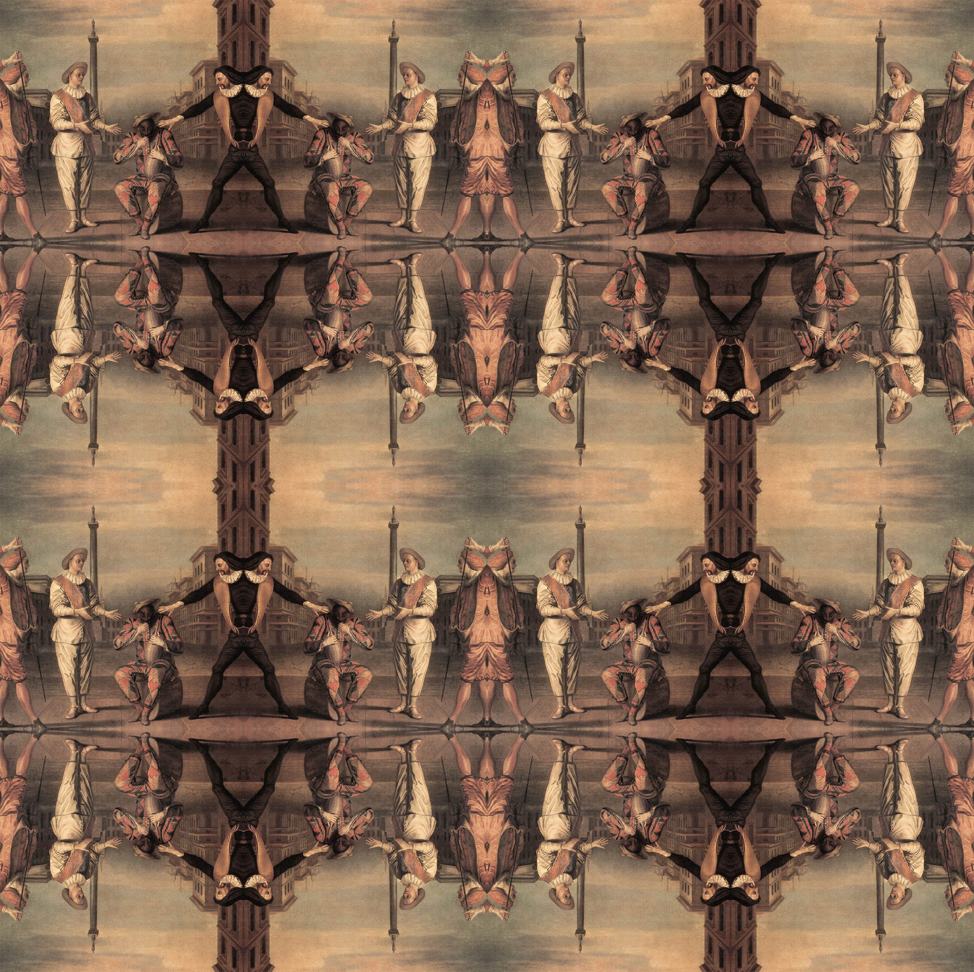
And then, if you want to go even further you can make a seamless background image by following the steps in this earlier tutorial here. Only difference would be that you should preferably use a square format rather than a rectangle and also that you pick an image (or crop a part of an image) which will look nice as a pattern The rest is very much the same: Flip, blend, merge, flip again, etc. And sometimes use a layer mask and sometimes not, depending on how things look... And remember that the strangest things can give you a result: Below I am linking a seamless image which I made out of an old master painting. So, basically use your imagination and experiment...


................................................................................................................................

Sunday, 6 March 2011

design stuff: background images

A few useful hints on how to choose background images:

Your design will go in one of two directions: You will either have boxes inside of which you place your content or you will do a free floating layout, such as the one you see here on the easy peasy site. These are two distinct approaches which will also determine your background images. If you have things boxed then you can be far more adventuresome with your background since the boxes will see to it that the content of your site stands apart from whatever it is that is going on behind them. If you go for the free floating look however, then the background will need to have very very low contrast, it really needs to go all the way back, so that it doesn't interfere with your content, be it images or text.

However, even if you have boxes, it may still be a good idea to consider what sorts of visual material will be part of the actual content later on. If you plan on using lots of really colorful images then it may still be a good thing to have a background which will not interfere with that. If, on the other hand, your content is mostly text based with relatively few images, or always low saturated ones - then it may be a really good idea to have a strong background.


I created a dummy site for this course, so that I can show examples of what I am talking about without ruining the real thing. Here, I put boxes underneath the content and then placed very high contrast black and white images into the background. Since the boxes create enough of a separator this does seem to work.

Another thing is the subject matter itself: Going back to the scuba diving website which one class member is thinking of doing. In all likelihood most of his images will be underwater photographs and so forth. In which case a nice deep sea image, or an abstract image in strong blue hues will probably look really good as a background for that.

A word which you will hear me say a lot over the next weeks is Gestalt. Essentially what this means is that any design work has to be considered as a whole, every visual component has to be related to everything else through closure, through alignment, proximity, similarity etc. So, the background is only one component of a complex system which we will be building together. The good news is that in web design you can always go back and adjust things, change things, add and delete things if they are not working out. That said, it is still good work practice to think about future visual relations as you are putting some thought into a background for your website now.

................................................................................................................................
tutorial: making a big background image and/or seamless tiling

Note:  I found out since I wrote this post that pixlr (a free online editor) also has layer masks. Which means  that you can do the exact same thing that I am describing below over there as well. True, the mask works a bit differently, but it will take you no time at all to figure it all out. 

Photoshop tutorial only I'm afraid... :-\. I really tried to find a way of doing this which does not involve buying software but couldn't. The only good news is that photoshop elements, the vastly cheaper 'lite' version of photoshop, lets you use layer masks also it seems...

OK, so you found an image but it is smaller than 1920x1200. Here is what you do (and please click on the images to see all the instructions nice and large):


Open the image in photoshop. Double click on the image icon that you see on the layer palette. This will turn the background into a layer.


Next step: From the top menu, go to Image > Canvas Size. Make sure you place the little anchor square on the top left and then change the canvas size values to 1920 and 1200. Once you have done this you will see that the image is now sitting on the top left and you have a transparent background to the bottom and to the right. These transparent areas are what you need to fill.


Once you have the canvas size in place, drag the layer onto the little page icon at the bottom of the Layer palette and duplicate it. Next, go to the top menu Edit > Transform > Flip Horizontal. Then, holding down the shift key (very important this!) drag the top layer to the right. Photoshop will give you a tiny 'stop' when you hit the document border and this is exactly where you stop if you want an image is perfectly symmetrical and can also be tiled.

Next, you go back to the top menu and go to Layer > Add Layer Mask > Reveal All and add a layer mask. (You will see the layer mask icon appear next to the image icon on the layer palette after you have done this). Then you go to the gradient tool in the tool box. Make sure from the tool options palette that you have the linear gradient, going from black to transparent. Then, again holding down the shift key, give the layer a few soft horizontal strokes, until everything is nicely blended.


Remove the layer mask by going back to the top menu, Layer > Remove Layer Mask > Apply.

Merge the two layers into one by using the layer palette (tiny arrow on the top right will take you there). However, do not Flatten Image, but Merge Visible!

Then duplicate the merged layer (again) and this time flip it vertically by going (again) to Edit > Transform > Flip Vertical. Move the layer down, until you get the tiny 'stop'. Repeat all steps above with the layer mask, except that this time you stroke vertically, still holding down the shift key.


And there you have it. This is now exactly the right size and is also tile-able, since it is symmetrical as well. All you need to do now is to save it in a web format. File > Save for Web > Jpeg or whatever and you are done! 

 (Tip:  If you upload a background image into blogspot via the template editor, it has to be below 300KB. So, check this as you are saving from photoshop.  ) 

................................................................................................................................

starting out with some design stuff now :-): background images and screen sizes


OK! Almost ready for some design fun! 

I figured that it might be nice to let you guyz start out with something that should be quite enjoyable - adding a background to your site. But before we get there, I would still like to remind you of something which is actually quite obvious: Not everyone has the same computer set-up and so everyone sees things differently, depending upon how large their screen is. There is a top left bias in all of this, which means that everyone, always, sees the top left corner of the browser. All else that people see varies from resolution to resolution.


The screenshot above shows you how this site is seen at a 1024x768 screen resolution. As the site's content slides left, one of my pixelmen is actually placing himself very nicely behind the header, so I am quite pleased about that. True, folk can no longer see the big pink fellow to the right but since the image that I have is more like an abstract backdrop I can live with that.

 (Tip:  A very nice freeware application that lets you test out screen sizes is Sizer (PC only). I would advise you to make use of it and often check to see how your site looks to others.  ) 

The widest screen resolution which we need to take into account is 1920x1080 or if we think lengthwise 1600x1200. However, this is not as wide or as high as it gets, Wikipedia gives a very nice list going all the way from the smallest to the largest sizes.

Some older websites are designed flush left, but nowadays for the largest part we tend to favor a centered layout. As the screen gets smaller all content will slide to the left of the screen.

 Upshot:  Your background image needs to take all of this into account. It is of no use whatsoever having a gorgeous image where the main elements are on the bottom right since there is no way that someone with a 1024 x 768 display setting is going to be able to see the stuff. It is equally bad to have full background images that are smaller than 1920 x 1200 (1920x1080 - 1600x1200) since anything smaller will result in really nasty patches when viewed on a large screen. So, unless you are tiling a small image (more on this later), always make sure that your full screen background image is larger than 1920x1200 and that the nice parts of the image are located towards the top and left. That way everyone, small and large, will be equally happy!  :-) 

 Update:  While all info above is still valid for most purposes, there is also an update on making resizeable full background images, which you can read here:
http://easypeasydesign.blogspot.com/2011/03/can-you-resize-background-image-on-non.html

................................................................................................................................
Girls Generation - Korean